
Building RigSight
Taskbar tiles worked on my taskbar, not on theirs
A GitHub issue asked for more colourful taskbar readings. RigSight 1.2.0 gave every reading a tile and a look of its own, and a bug report 94 minutes later showed a fallback I had never told anyone about.
The short version
Someone on GitHub asked for more colourful taskbar readings. I built tiles and seven looks in a day. Ninety-four minutes after the release, they found three looks missing on their smaller taskbar. The fix came the next morning.
On 2 November someone opened an issue on RigSight's GitHub. They asked for taskbar readings that were more colourful and cleaner, with different graphs, and pointed me at Pulsar, an open source app that puts PC stats on the taskbar. Until then, RigSight's taskbar readings were plain numbers with a short name under each, and a small graph behind the name if you turned it on.
Pulsar is under the GPL licence and RigSight is under MIT, so Pulsar's code can't go into RigSight. I could still borrow its ideas, and it had plenty of them.
A day of tiles
I built it on 3 November. Every reading now sits on a tile of its own, in its part's colour or any colour you pick. Each reading gets its own look too. There's a filled, line or bar graph, and for temperatures and loads a level, blocks or a ring. Width makes the strip Compact, Standard or Roomy. I picked those names after looking at what Gmail and Outlook call the same kind of setting.
Two decisions took me longer than the code. The first was who gets tiles. Everyone who already had readings in the taskbar got them, and anyone with none got nothing added. Setting Background to None on the Taskbar page brings back the old look.
The second was room. My first mock-up ran the readings over the app buttons in the middle of the taskbar. When I checked, the real strip had the same flaw with enough readings, because it never looked at where the apps were. Now, when room runs out, the graphs first narrow to the width of their words. Then the last readings wait in a +N tile that names them when you point at it.
Pulsar also stacks readings in two rows, and my first thought was why I had never done that. Halfway through building it I stopped, because I had the readings pair up in the order they were listed. Download and upload belong in one box, and only you know which two of your readings go together. So in Two rows you choose the pairs, and any reading can sit on its own.
The two icon styles got bigger in Windows 11 too, 24 pixels instead of Windows' 16, each on a tile in its part's colour. RigSight 1.2.0 went out that evening, and I replied on the issue with what I had added.
Ninety-four minutes later
The same person opened a new issue with a picture of their taskbar. Level, Blocks and Ring didn't work. They also asked whether clicking a reading could show more about it.
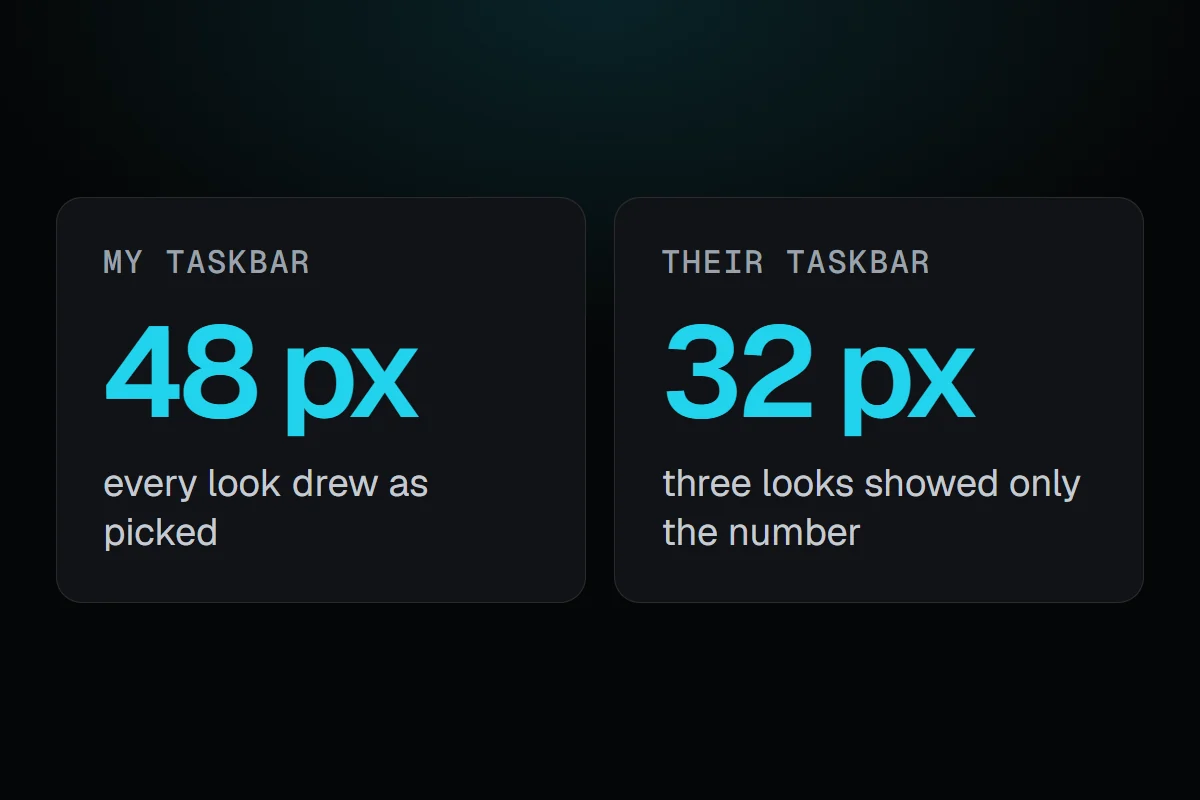
Their taskbar uses Windows 11's smaller taskbar buttons, so it is 32 pixels tall instead of the usual 48. On a taskbar that short there's no room for the name under the number, so RigSight puts each reading on one line. And on one line, I had Level, Blocks and Ring fall back to a filled graph. It was worse than that, because a reading with one of those three looks doesn't keep the history a graph needs. The graph had nothing to draw, so all they saw was the number.
That fallback came from one of my early mock-ups. I wrote it down as a detail and then forgot it. Nothing on the Taskbar page said it would happen, and the page's own preview kept showing Blocks and Ring. On my taskbar every look drew as picked, so I never saw it.
In 1.2.0
On a 32 px taskbar, Level, Blocks and Ring showed only the number, and nothing said why.
Since 1.2.1
Whatever height your taskbar is, the look you pick is the look you get.
The fix, and the card they asked for
RigSight 1.2.1 went out a little after 9 AM the next morning. On one line, Level is a band behind the words, Blocks are a row under the line, and a ring leads the tile like an icon, the way Pulsar draws its own. Every reading on that short taskbar sits on a tile of the same height. Two rows leaves room above, between and below its two lines instead of filling the box edge to edge.
Clicking a reading now opens a card above it. It shows the last ten minutes on a small graph with the low, average and high, that part's other readings, the apps using it most right now and a button to the page it belongs to. For fans it lists what they are cooling instead of apps. Click a box in Two rows, or an icon per part, and the card shows both readings side by side.
I closed both issues with a note of what changed.
The bug itself was small. What bothered me was the kind of bug it was. RigSight dropped something you picked and didn't tell you. That's the same mistake as a page saying "nothing recorded" while it is still loading, which I wrote about in The tests said 15 milliseconds. The app froze. I have one PC with one taskbar size, so 1.2.1 also added a test for a 32 pixel taskbar. A picked look now has to draw there before a release can go out.